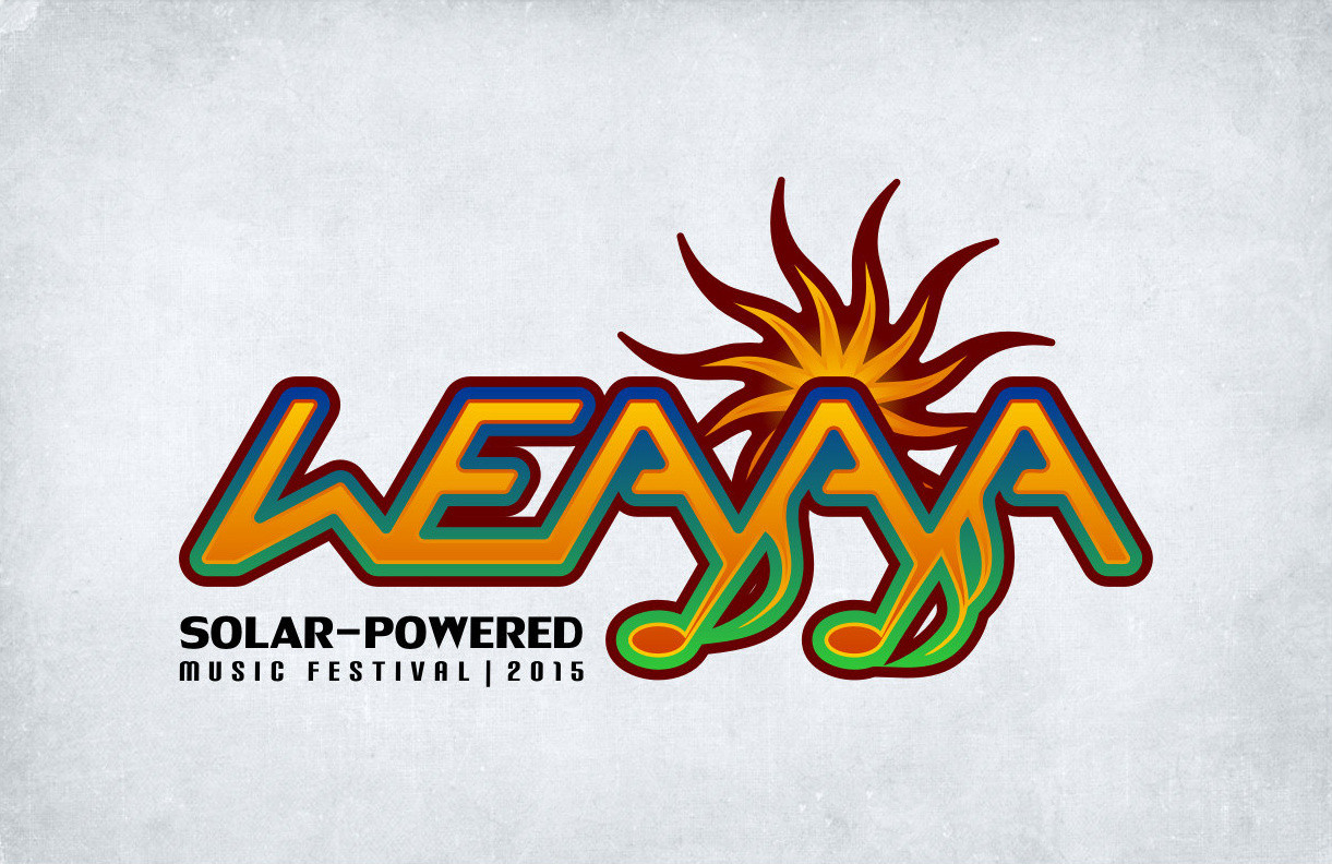
WEAYAYA
This concept was developed for a burgeoning music festival whose purpose is to promote increased awareness of solar energy and its benefits in terms of environmental preservation. The word “weayaya” is Sioux for “setting sun,” hence the somewhat traditional aesthetic of the piece (e.g., the wispy, filamentous look of the sun element and quarter-note flags contained in the “A”’s of the logo.) The logo’s colour scheme is also highly symbolic. For example, the brown/red outline that encompasses the whole logo represents the physical boundary of Earth, while the green and blue gradient symbolizes the ground (grass) and sky with the oranges and yellows represent the warmth and radiance of the sun.